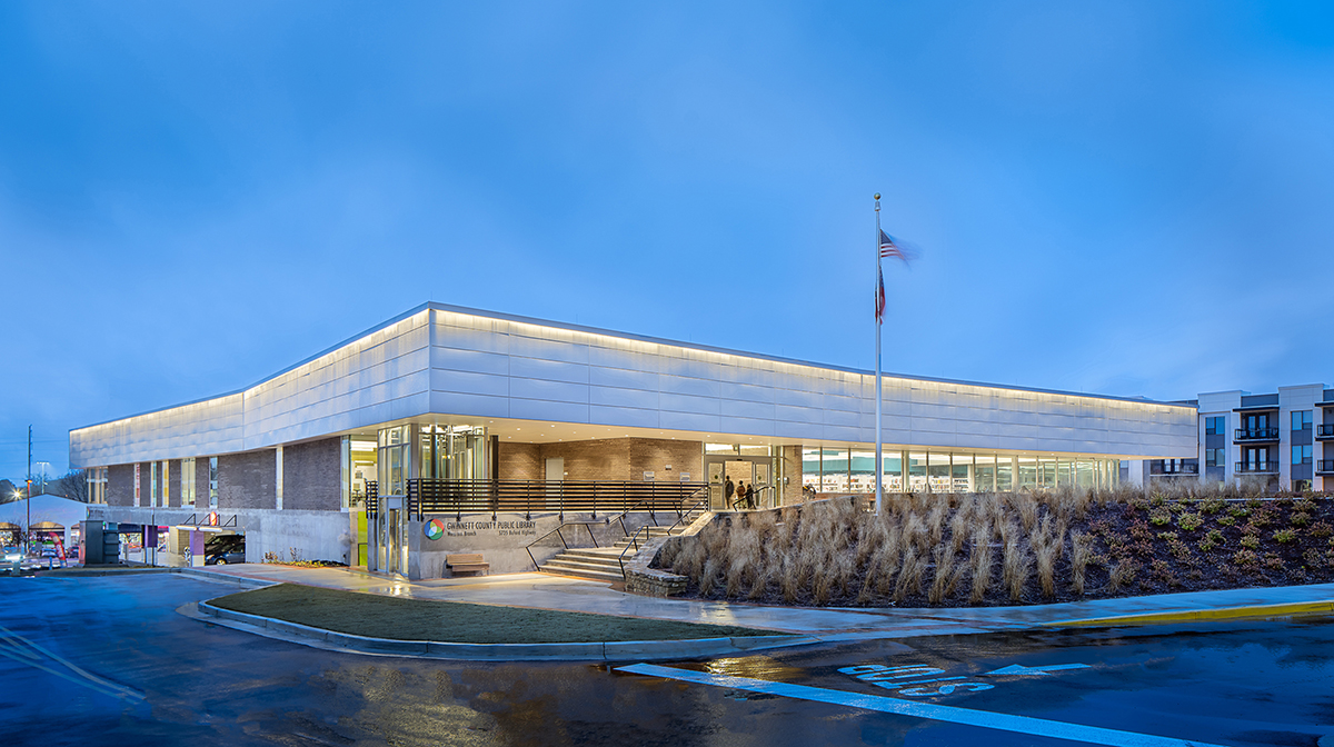
Norcross Library
Norcross Library
Gwinnett County Public Library System
Gwinnett County Public Library System
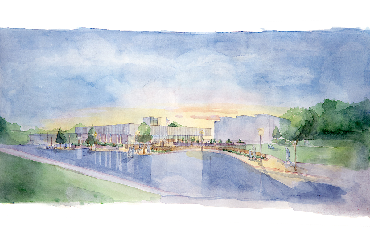
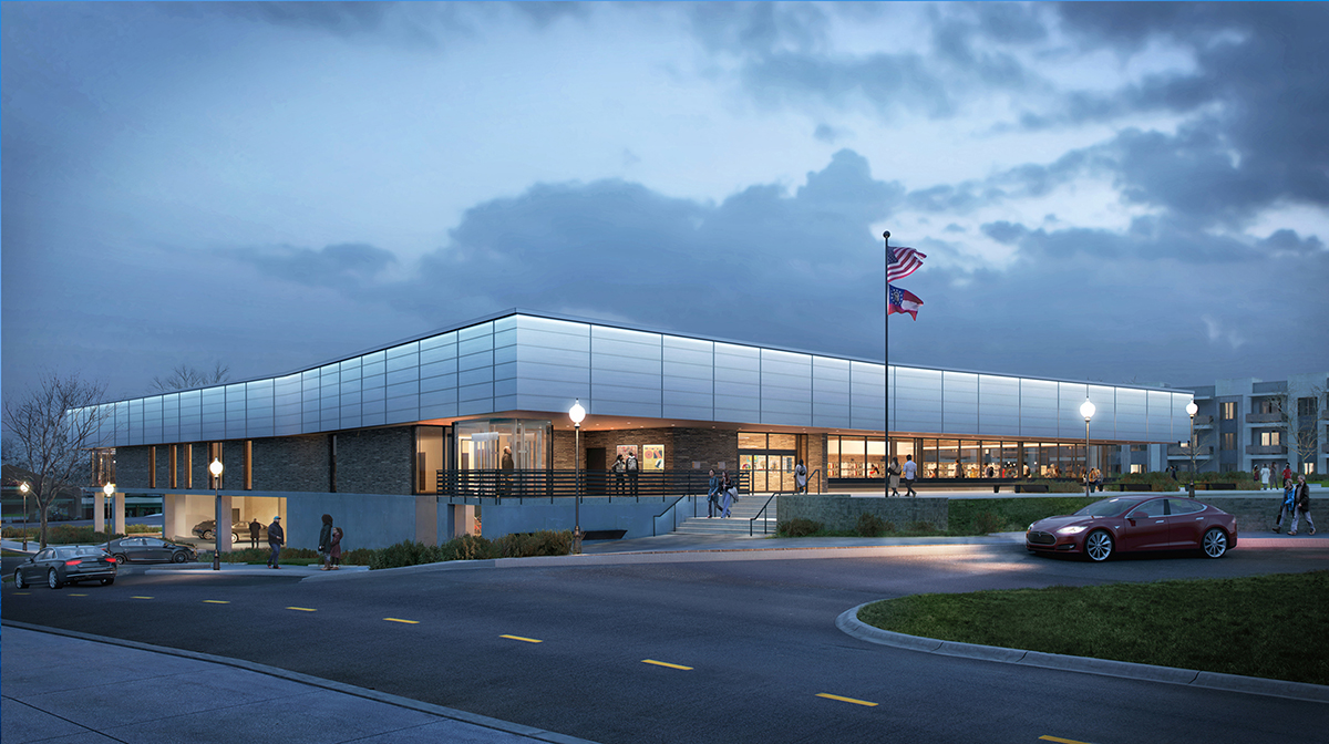
A library on the park
The public library is first and foremost a place; the family room of a community. Positioned between a pocket park and a well-traveled highway, the LEED library’s design strives to create a welcoming environment, embracing the landscape and maximizing connection to the outdoors.
SIZE
22,000 SF Library
Single story
New Construction
132 space parking structure
CONSTRUCTION COST
$12.3 million
Design Bid Build
FUNDING
SPLOST with inter Government funding City of Norcross
OCCUPANCY DATE
November 2021
SUSTAINABILITY
LEED Ver 4 Certified
SHELVING CAPACITY
40,000
PUBLICATIONS
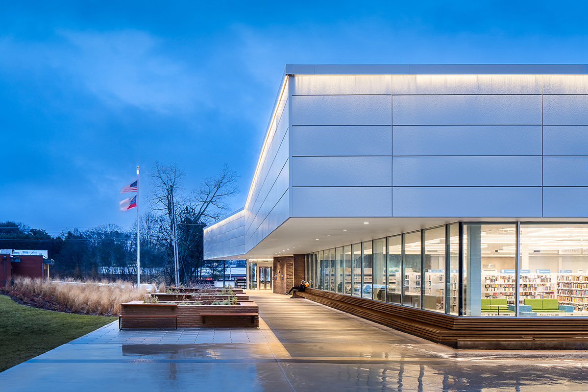
Exterior Room
The overarching design goal was for the library to integrate into its natural setting. The building, its furnishings, and the adjacent park become cohsive parts of one unifed, interrelated composition.
Connecting
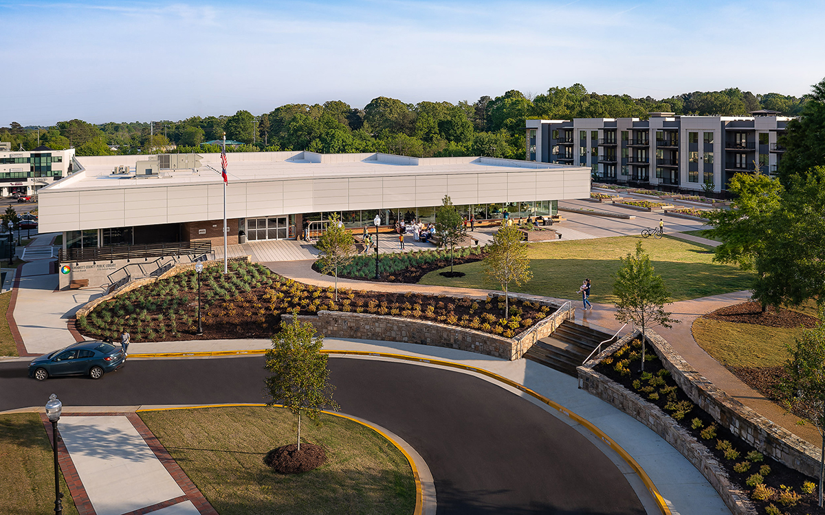
The interweaving of the plaza, green roof, and park creates new opportunities for outdoor programming.
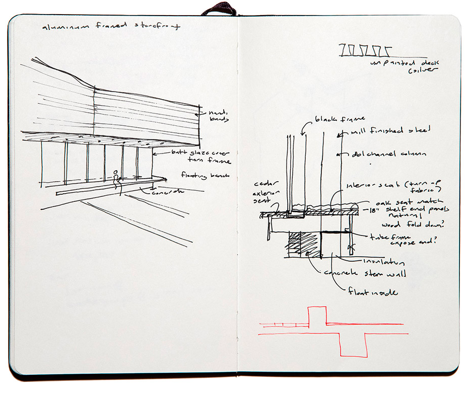
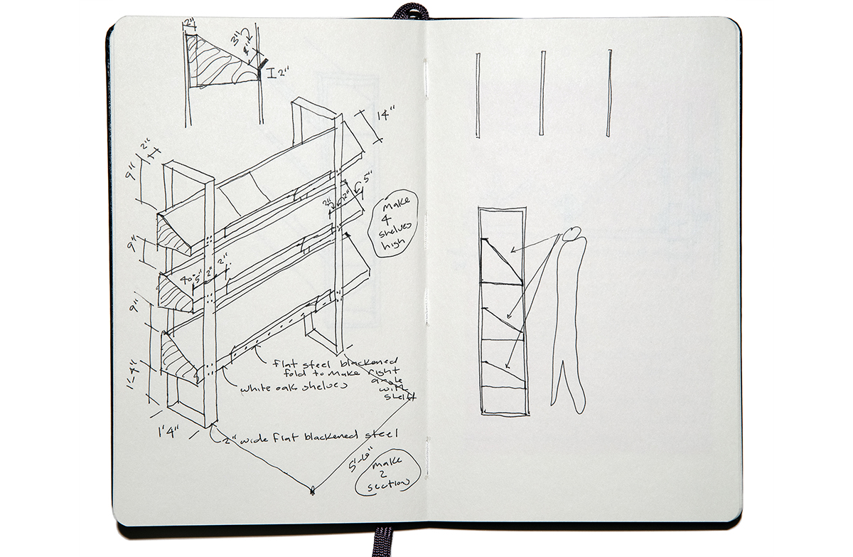
Corner window with a view
An early sketch details an open corner window, providing unobstructive views to the landscape.
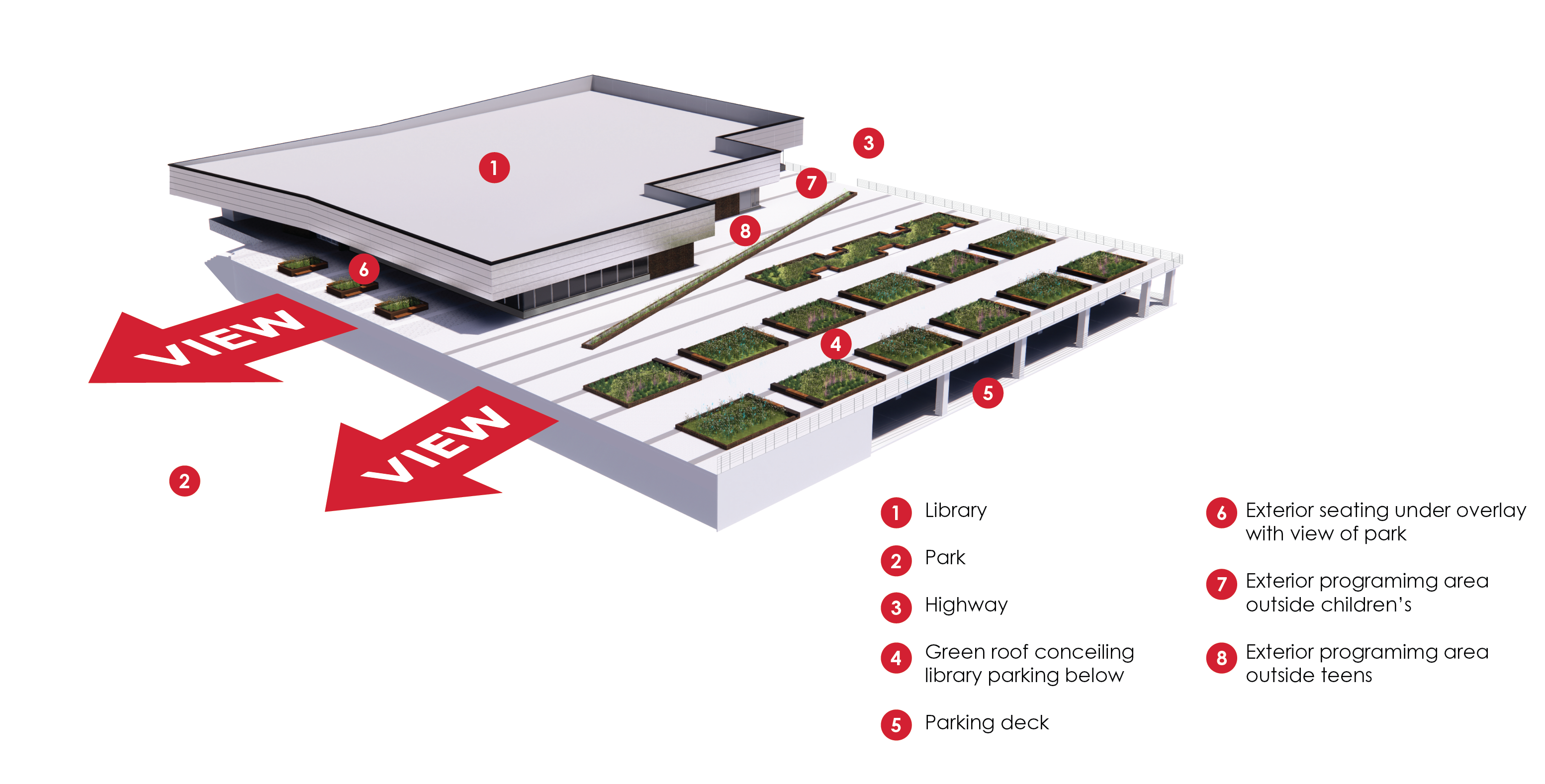
Integration with nature
The park in which the library occupies played a vital role in the design process. Using various elements, including planters and pathways, the design blends indoor and outdoor spaces into the natural landscape
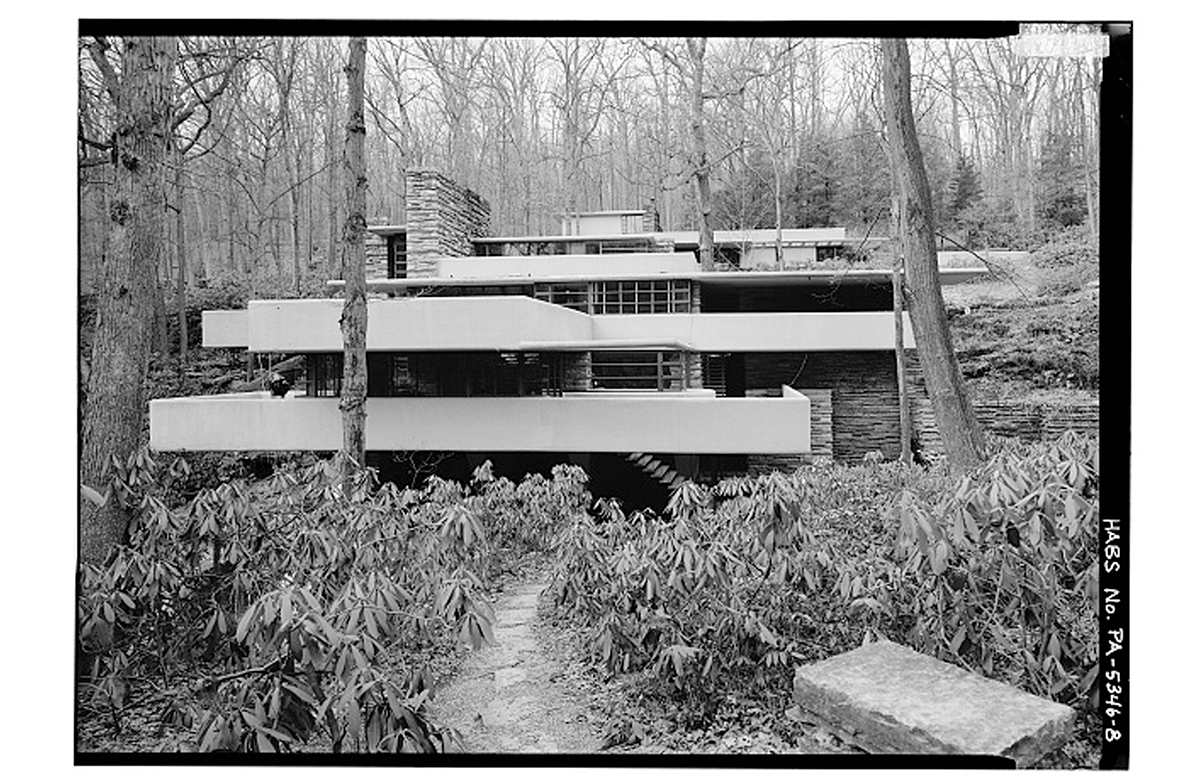
Falling Water - Frank Lloyd Wright
The epitome of “organic architecture, Fallingwater’s design symbolizes the harmony between people and nature.
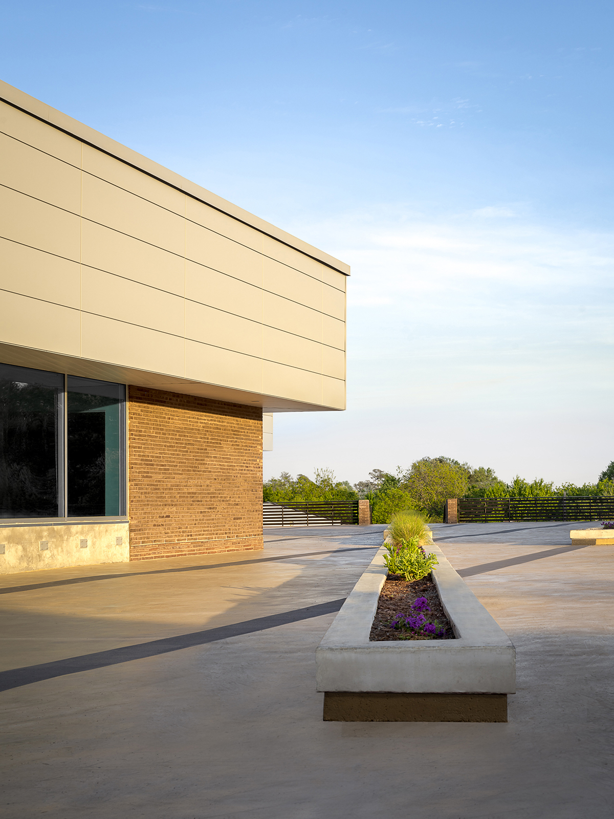
The library incorporates strong horizontal lines to emphasize a pulling into the landscape.
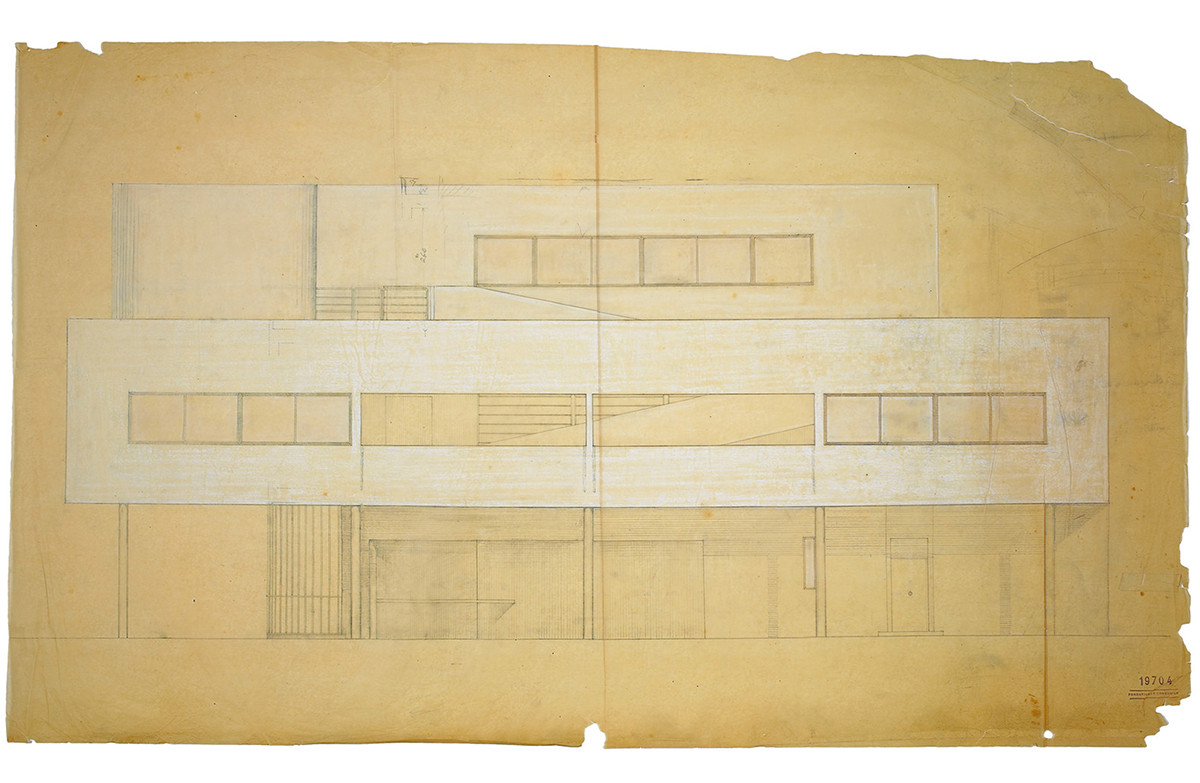
Villa Savoye - LeCorbusier
Villa Savoye was the vision of Le Corbusier’s 5 points to a new architecture, as a paradign of the “machine for living”. The building incorporates ribbon windows and a rooftop garden to embrace and frame the landscape. The ground level consists of a parking garage.
The library incorporates a raised green roof to conceal parking on the ground level. Horizontal windows provide offer panaramic views of the landscape.
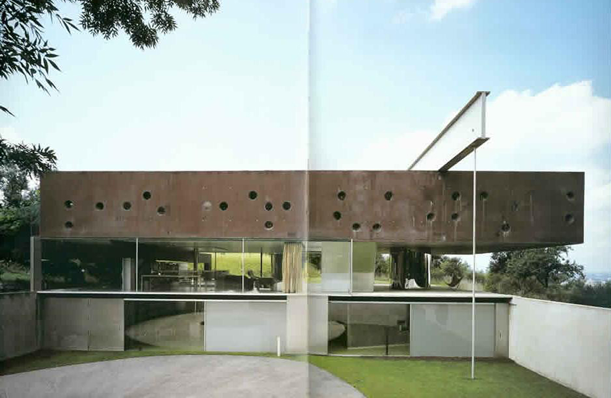
Maison a Bordeaux - Rem Koolhaas
The Maison a Bordeaux is a private residence of three floors on a hill overlooking Bordeaux. Comprised of three horizontal layers, the design is half inside and half outside.
The library blurs the distinction between inside and outside thru an exterior room defined with a low ceiling.
Pulling inspiration from Ridley Scott’s 1982 sci-fi blockbuster Blade Runner, the library’s elevation is comprised of three horizontal layers increasing in refinement. The ground level (street) is concrete (rough), middle level brick and glass (more refined), top level (ideal) is metal (smooth).
The window arrangement around the building responds to the speed of travel. Fewer windows are placed along the busy highway (faster speed). Expansive glass walls open up to the adjacent park (slower speed).
“I have found Chad to be forward thinking and progressive in his approach to library design and implementation. Chad and I both share a passion for libraries and he really understands the importance of the library to the community.”
Mr. Charles Pace, Executive Director, Gwinnett County Public Library
Front porch
Today’s library incorporates all types of environments and spaces for interaction. An exterior room, outfitted with power and Wi-Fi access, provides the opportunity for exterior programming, work after library hours or while watching children play in the park.
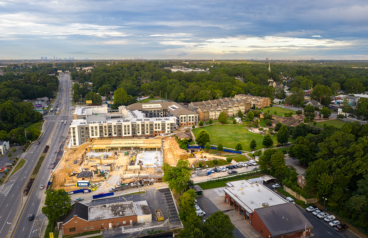
Suburb of Atlanta
The last stop on the old railway spur from the City of Atlanta (seen in the distance), Norcross is listed on the National Register of Historic Places. The library can be seen under construction to the left of the 4-acre Lillian Webb Park.
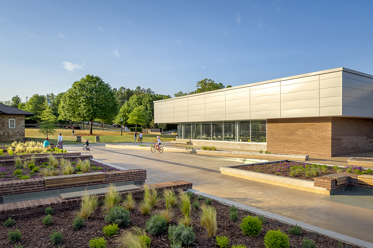
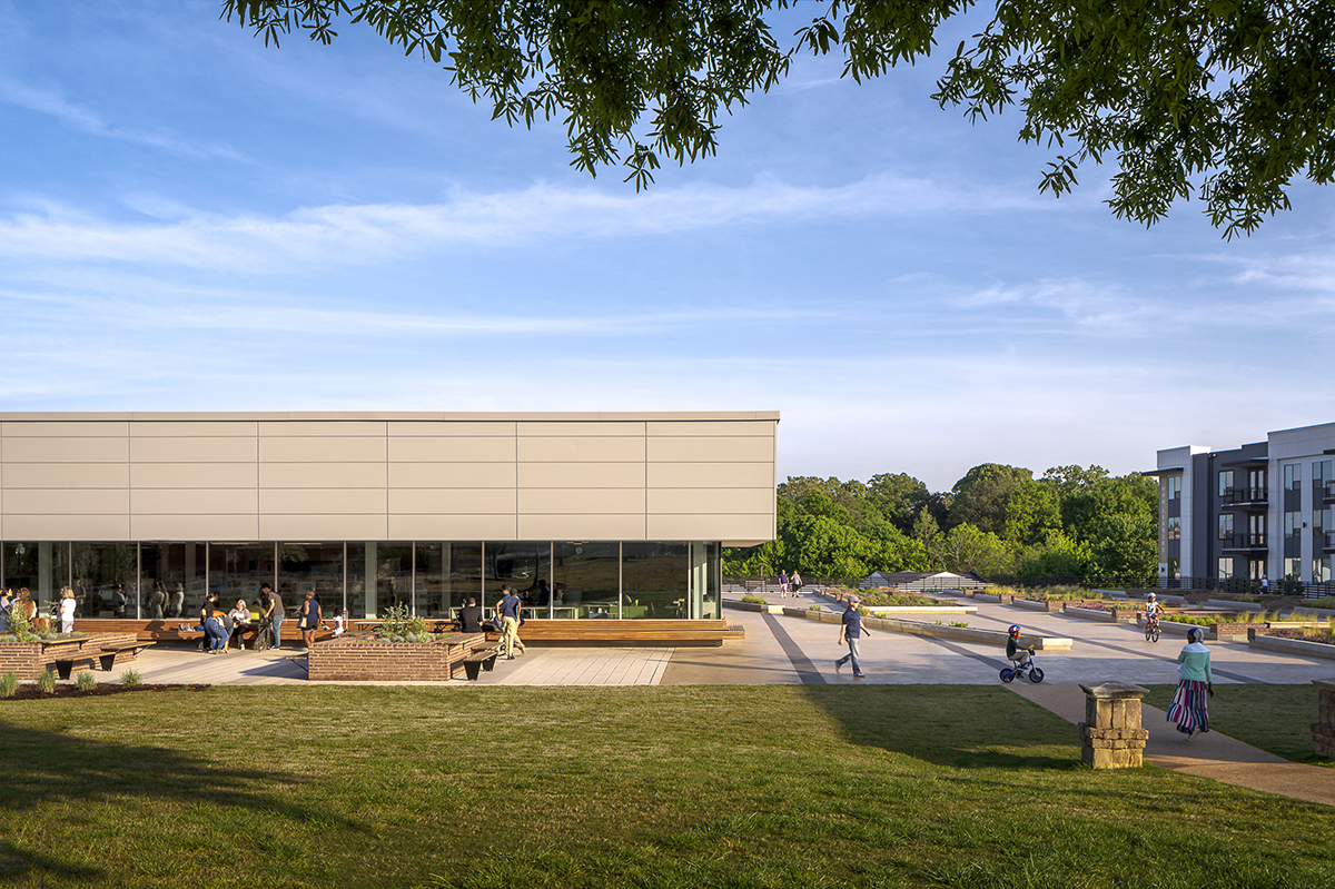
Green Roof
The library is LEED Certified through site development, water and energy efficiency, use of sustainable materials, and indoor environmental quality. The design utilizes a green roof to conceal parking below.
Post modern plaza
Commenting on the perfection of the Salk Institute plaza, the library embraces a Postmodern design sensitivity.
In opposition to the grand perfectionism of modernism, water is substituted for soil within the centeral feature, the symmetry is incomplete with only a building framing one side, and diagonals cut thru the planter rather than lead to the horizon.
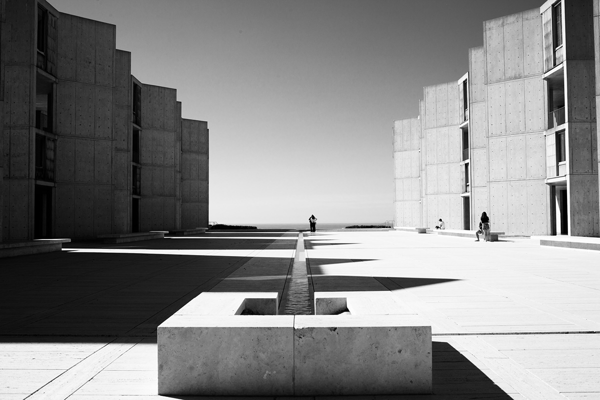
Salk Institute - Louis I. Kahn
The defining work of Architect Louis I. Kahn, the Salk Institute laboratory cluster consisted of two parallel blocks enclosing a water garden. The buildings frame a long view of the Pacific Ocean, accentuated by a thin linear fountain that seems to reach for the horizon.
Architect Chad Cas’ Thesis Advisor at Princeton was the acclaimed architect and teacher Carles Vallhonrat. From 1960 to 1971, Mr. Vallhonrat worked in the office of Louis I. Kahn as principal assistant to Mr. Kahn in the design of the Salk Institute.
Signing the work
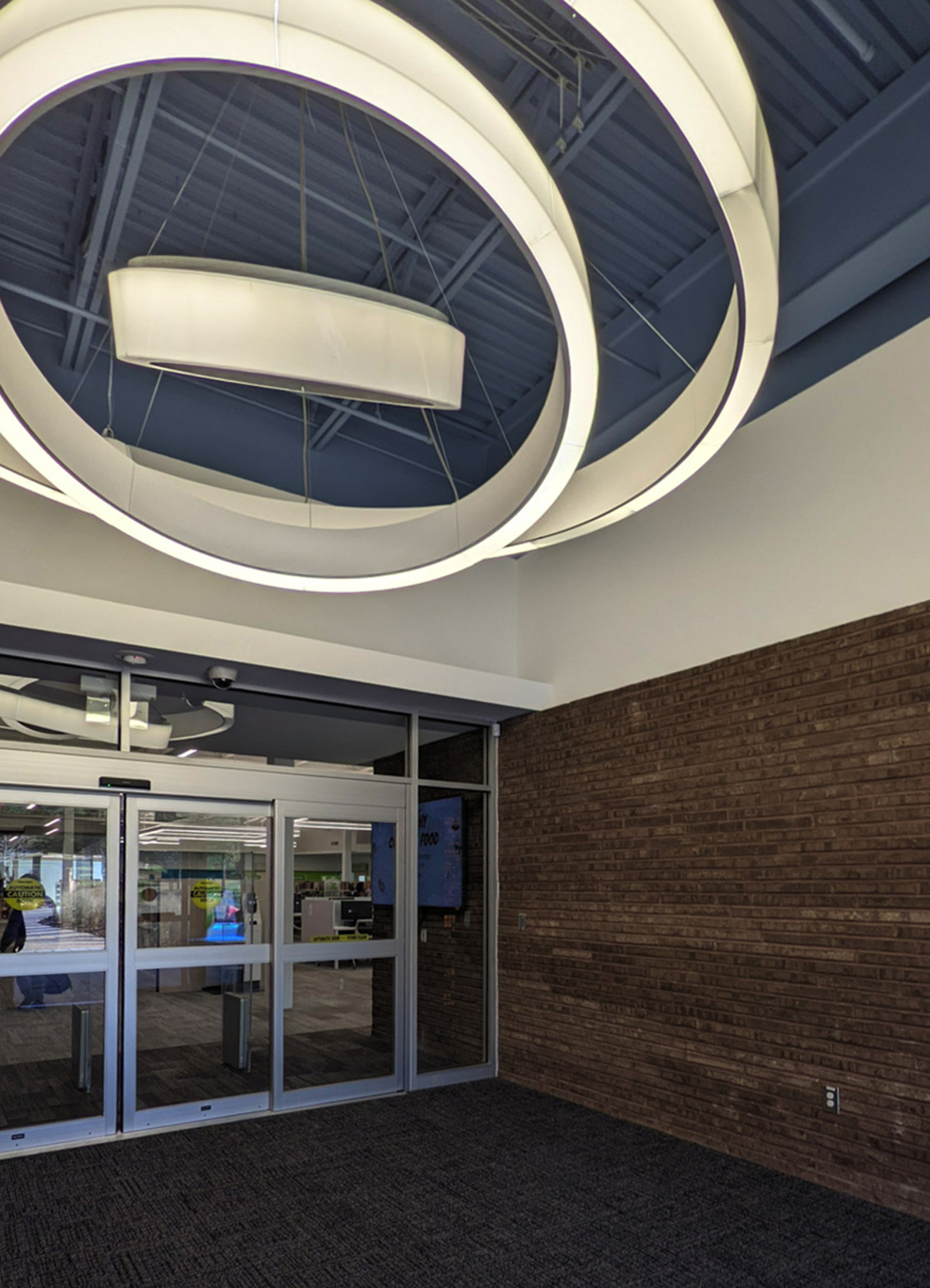
The entry is defined by the Architect’s two signature elements. The ceiling is painted Michael Graves’ signature powder blue. Mr. Graves was architect Chad Alexander Smith’s professor.
A Latin epigram is hidden in binary code on the glass doors. “Bonus intra. Melior exi.” translates “Come in good. Go out better.” Read more https://www.casarc.com/2019/07/29/bonus-intra-melior-exi/
Reading Room
The view to the park is accentuated by the lines of the carpet and lines of the soffit, drawing the eye to the fountain in the distance.
Being mobile
Computers teathered to outlets are giving way to wireless and mobile devices.
In touch with nature
Long, low, sweeping lines and natural light played a major part in the design. Natural light from the horizontal windows aids the work and reading environment, keeping the inside of the library in touch with the natural surroundings.
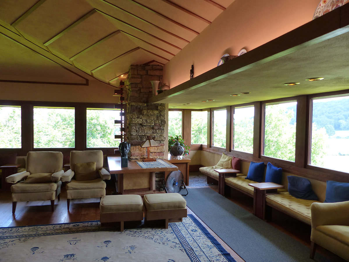
Taliesin - Frank Lloyd Wright
Mr. Wright believed in designing in harmony with humanity and the environment, a philosophy he called organic architecture. Low ceilings and horizontal windows characterized his architecture. In his home above, the windows can be seen wrapping the corner. The open corner and wrapping window pattern can be seen in the library elevation. Similar to Taliesin, bench seating at the window wall as well as the low ceiling continuing from inside to outside was incorporated in the library design.
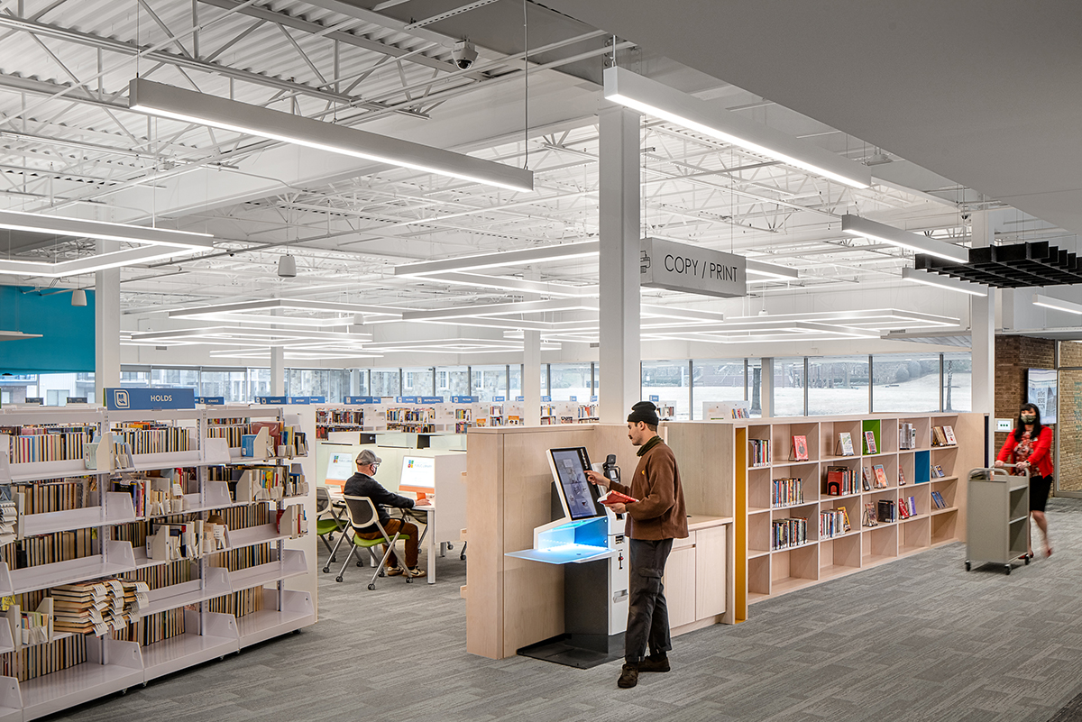
Using technology to make library operations leaner, more cost efficient, and more productive
The library utilizes the Open+ system developed by Bibliotheca that automatically controls and monitors building access, public computers, lighting, alarms, public announcements and patron safety. The tradional service desk is replaced with self-service kiosks. This “unhoming” of staff raises productivity and worker satisfaction.
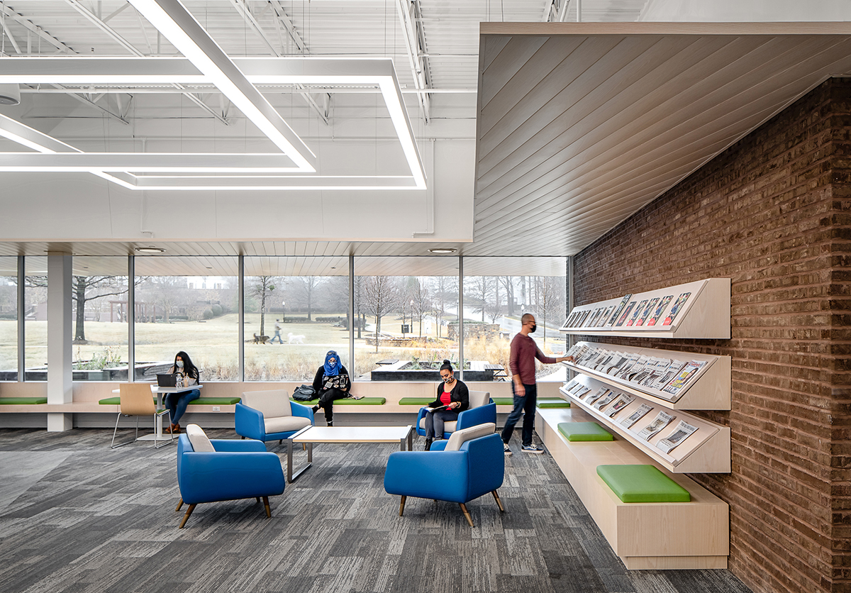
Periodicals Nook
The brick walls continue from outside to inside, bringing the landscape into the interior. Roman brick is used to accentuate the horizontality of the architecture. Roman brick is shorter and twice as long as standard brick, giving it a long stretching feel. Frank Lloyd Wright used Roman brick on a number of his houses including the Robie house to instill a sense of horizontal conveyed by the flat landscape of the American prairie.
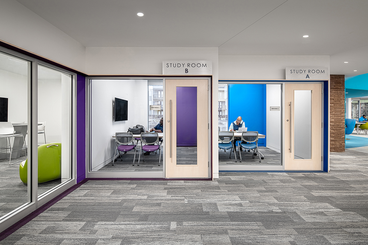
Quiet Study
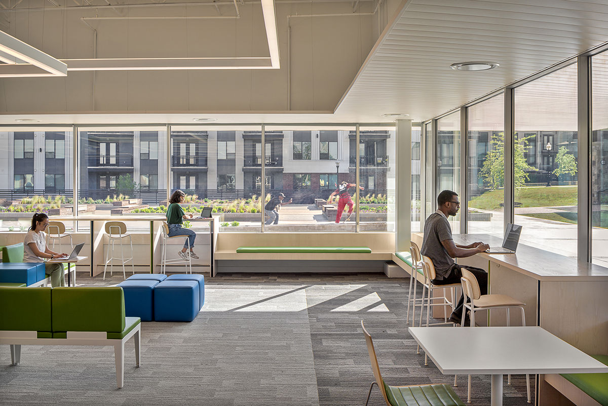
The interior of the library incorporates distinct program zones ranging from group collaboratoin to individual study.
Creating a highly effective library involves more than banks of computers and access to Wi-Fi - it’s about integrating work and life.
Using color theory to influence behavior
Color is a powerful communication tool and can be used to signal action, influence mood, and even influence physiological reactions.
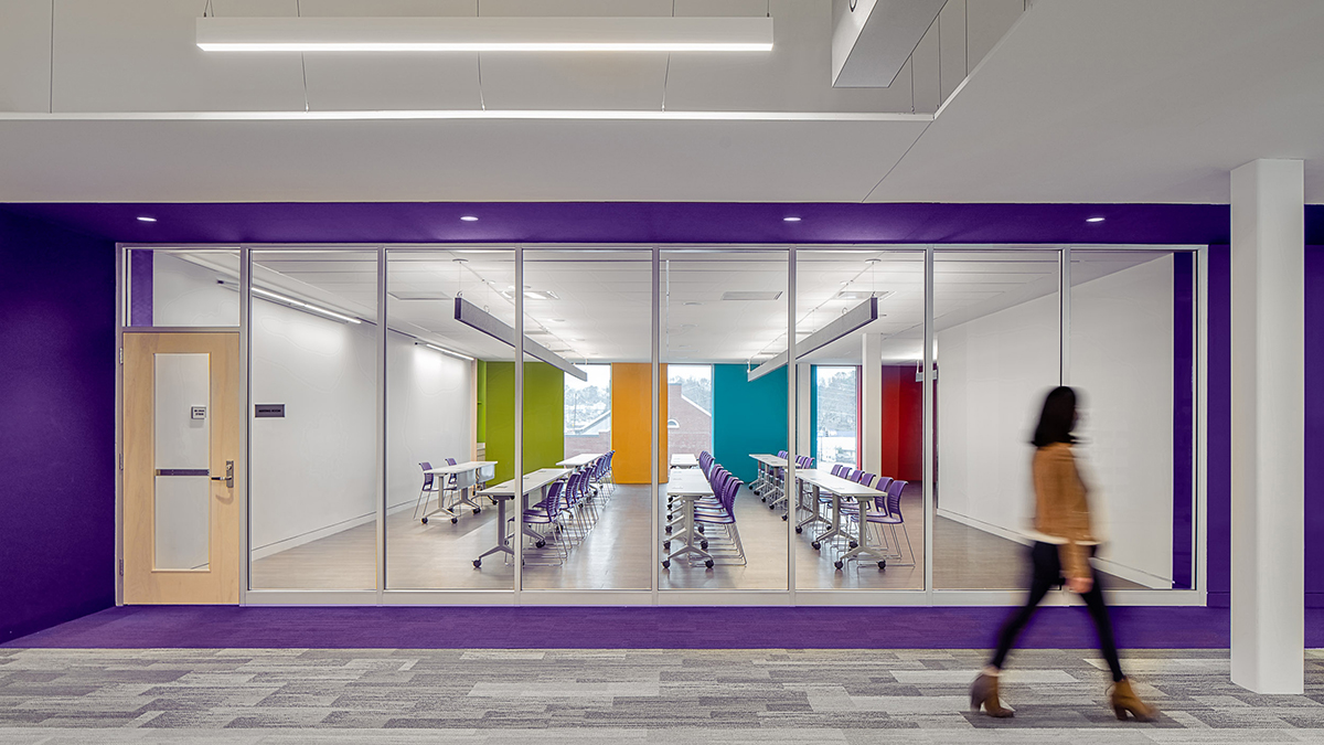
Large Programming Room
Color is used to signify entry and activity in the library. Purple defines entry into the programming room. A multicolored wall made of felt subtly suggests a range of activities take place within the room from lectures, classroom instruction and group activities.
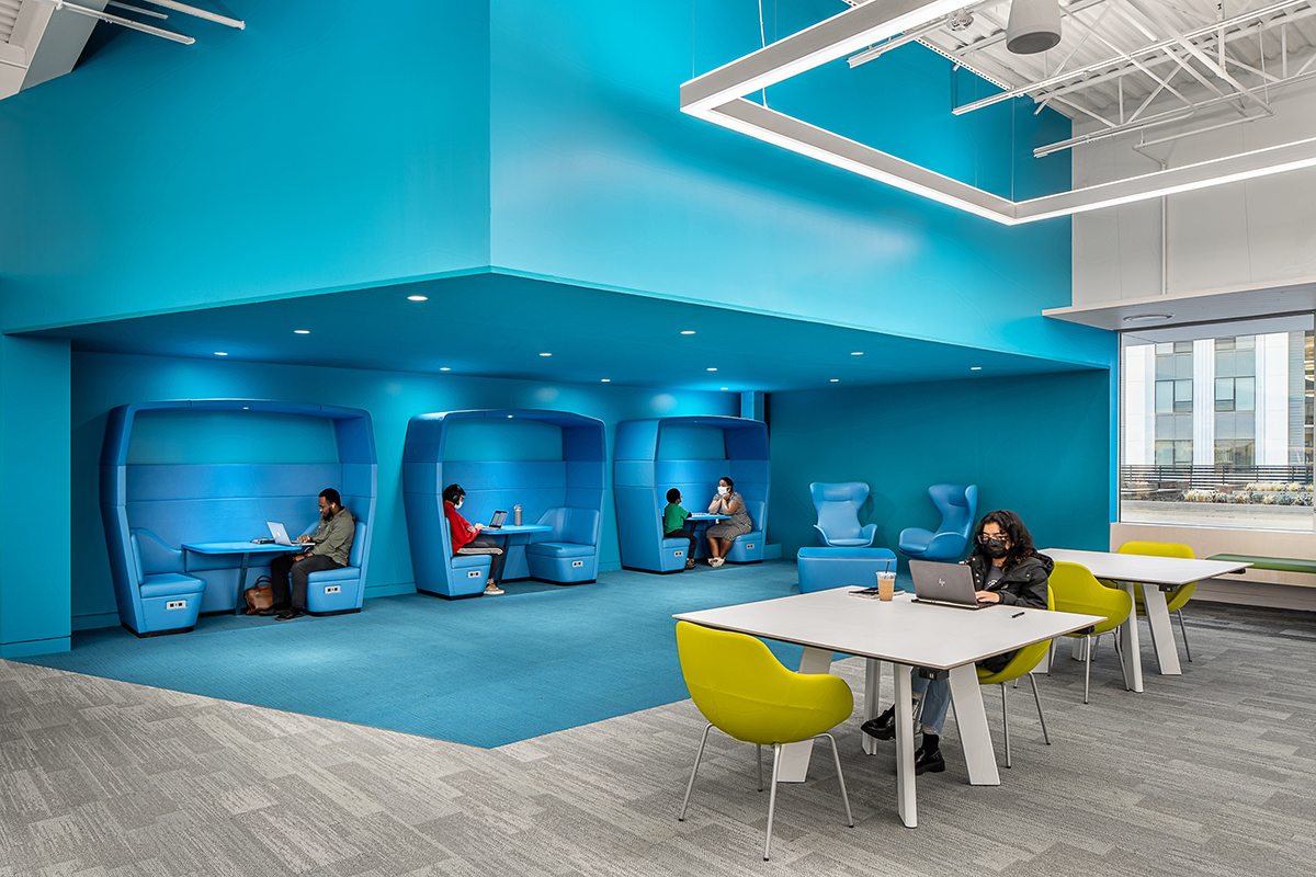
Living Room
The “living room” above incorporates blue felt walls and a low ceiling. Studies show low ceilings are conducive to concentrated work. The color blue offers a relaxing feel.
People and Place
Creating a range of spaces from which patrons can choose, based on their mood and task, is critical to a successful library.
Story Time
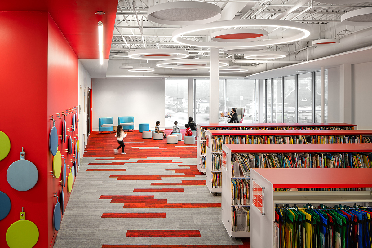
The children’s area is divided into two distinct color areas. The warm red of the story time area evokes higher arousal emotions, such as happiness and passion. A low ceiling and low shelving bring the scale of the space down to the size of children. Accoustic wall and ceiling accents keep noise contained.
Story time can be one of the most impactful learning experiences a child can have gaining a sense of their world through both story and play.
Children’s reading
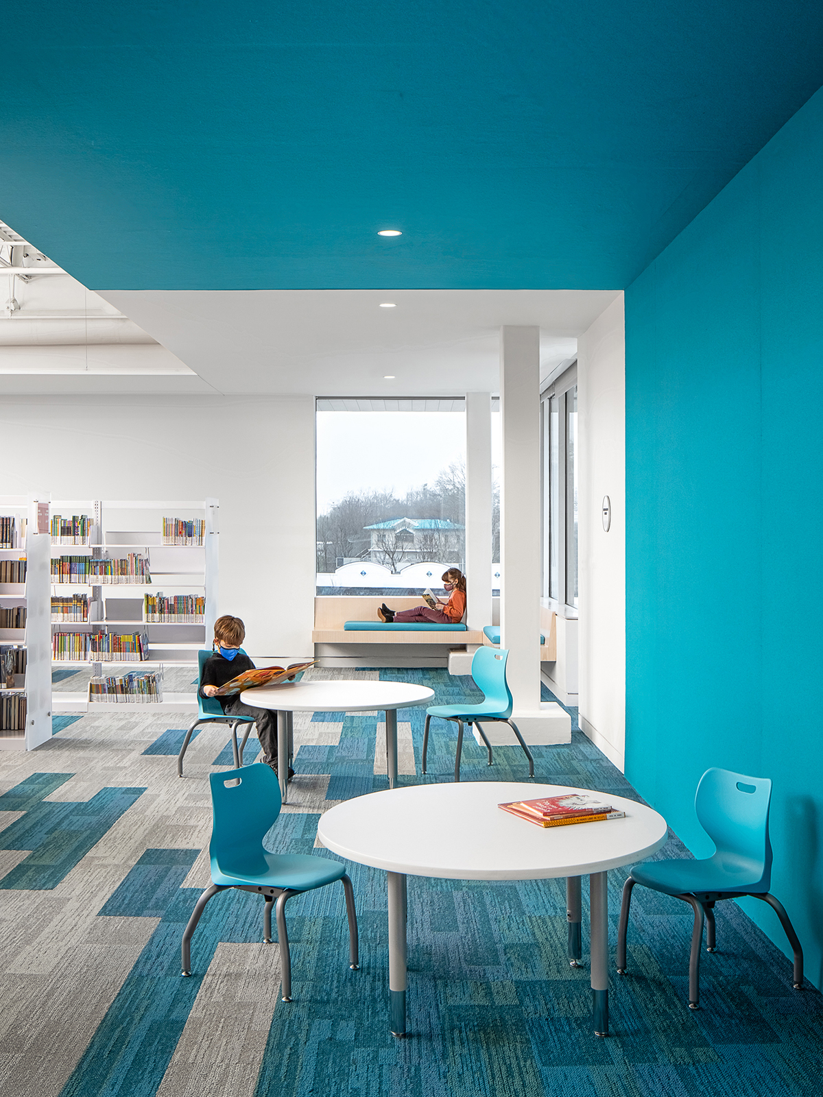
Blue is used in the reading area to create calmness and relaxation. A corner window seat offers an inviting place to curl up with a good book.
Exterior Room
The overarching design goal was for the library to integrate into its natural setting. The building, its furnishings, and the adjacent park become cohsive parts of one unifed, interrelated composition.
Connecting
The interweaving of the plaza, green roof, and park creates new opportunities for outdoor programming.
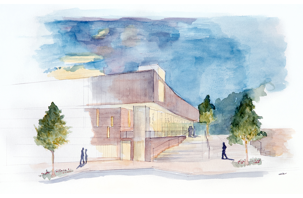
Corner window with a view
An early sketch details an open corner window, providing unobstructive views to the landscape.
Integration with nature
The park in which the library occupies played a vital role in the design process. Using various elements, including planters and pathways, the design blends indoor and outdoor spaces into the natural landscape
Falling Water - Frank Lloyd Wright
The epitome of “organic architecture, Fallingwater’s design symbolizes the harmony between people and nature.
The library incorporates strong horizontal lines to emphasize a pulling into the landscape.
Villa Savoye - LeCorbusier
Villa Savoye was the vision of Le Corbusier’s 5 points to a new architecture, as a paradign of the “machine for living”. The building incorporates ribbon windows and a rooftop garden to embrace and frame the landscape. The ground level consists of a parking garage.
The library incorporates a raised green roof to conceal parking on the ground level. Horizontal windows provide offer panaramic views of the landscape.
Maison a Bordeaux - Rem Koolhaas
The Maison a Bordeaux is a private residence of three floors on a hill overlooking Bordeaux. Comprised of three horizontal layers, the design is half inside and half outside.
The library blurs the distinction between inside and outside thru an exterior room defined with a low ceiling.
Pulling inspiration from Ridley Scott’s 1982 sci-fi blockbuster Blade Runner, the library’s elevation is comprised of three horizontal layers increasing in refinement. The ground level (street) is concrete (rough), middle level brick and glass (more refined), top level (ideal) is metal (smooth).
The window arrangement around the building responds to the speed of travel. Fewer windows are placed along the busy highway (faster speed). Expansive glass walls open up to the adjacent park (slower speed).
“I have found Chad to be forward thinking and progressive in his approach to library design and implementation. Chad and I both share a passion for libraries and he really understands the importance of the library to the community.”
Mr. Charles Pace, Executive Director, Gwinnett County Public Library
Front porch
Today’s library incorporates all types of environments and spaces for interaction. An exterior room, outfitted with power and Wi-Fi access, provides the opportunity for exterior programming, work after library hours or while watching children play in the park.
Suburb of Atlanta
The last stop on the old railway spur from the City of Atlanta (seen in the distance), Norcross is listed on the National Register of Historic Places. The library can be seen under construction to the left of the 4-acre Lillian Webb Park.
Green Roof
The library is LEED Certified through site development, water and energy efficiency, use of sustainable materials, and indoor environmental quality. The design utilizes a green roof to conceal parking below.
Post modern plaza
Commenting on the perfection of the Salk Institute plaza, the library embraces a Postmodern design sensitivity.
In opposition to the grand perfectionism of modernism, water is substituted for soil within the centeral feature, the symmetry is incomplete with only a building framing one side, and diagonals cut thru the planter rather than lead to the horizon.
Salk Institute - Louis I. Kahn
The defining work of Architect Louis I. Kahn, the Salk Institute laboratory cluster consisted of two parallel blocks enclosing a water garden. The buildings frame a long view of the Pacific Ocean, accentuated by a thin linear fountain that seems to reach for the horizon.
Architect Chad Cas’ Thesis Advisor at Princeton was the acclaimed architect and teacher Carles Vallhonrat. From 1960 to 1971, Mr. Vallhonrat worked in the office of Louis I. Kahn as principal assistant to Mr. Kahn in the design of the Salk Institute.
Signing the work
The entry is defined by the Architect’s two signature elements. The ceiling is painted Michael Graves’ signature powder blue. Mr. Graves was architect Chad Alexander Smith’s professor.
A Latin epigram is hidden in binary code on the glass doors. “Bonus intra. Melior exi.” translates “Come in good. Go out better.” Read more https://www.casarc.com/2019/07/29/bonus-intra-melior-exi/
Reading Room
The view to the park is accentuated by the lines of the carpet and lines of the soffit, drawing the eye to the fountain in the distance.
Being mobile
Computers teathered to outlets are giving way to wireless and mobile devices.
In touch with nature
Long, low, sweeping lines and natural light played a major part in the design. Natural light from the horizontal windows aids the work and reading environment, keeping the inside of the library in touch with the natural surroundings.
Taliesin - Frank Lloyd Wright
Mr. Wright believed in designing in harmony with humanity and the environment, a philosophy he called organic architecture. Low ceilings and horizontal windows characterized his architecture. In his home above, the windows can be seen wrapping the corner. The open corner and wrapping window pattern can be seen in the library elevation. Similar to Taliesin, bench seating at the window wall as well as the low ceiling continuing from inside to outside was incorporated in the library design.
Using technology to make library operations leaner, more cost efficient, and more productive
The library utilizes the Open+ system developed by Bibliotheca that automatically controls and monitors building access, public computers, lighting, alarms, public announcements and patron safety. The tradional service desk is replaced with self-service kiosks. This “unhoming” of staff raises productivity and worker satisfaction.
Periodicals Nook
The brick walls continue from outside to inside, bringing the landscape into the interior. Roman brick is used to accentuate the horizontality of the architecture. Roman brick is shorter and twice as long as standard brick, giving it a long stretching feel. Frank Lloyd Wright used Roman brick on a number of his houses including the Robie house to instill a sense of horizontal conveyed by the flat landscape of the American prairie.
Quiet Study
The interior of the library incorporates distinct program zones ranging from group collaboratoin to individual study.
Creating a highly effective library involves more than banks of computers and access to Wi-Fi - it’s about integrating work and life.
Using color theory to influence behavior
Color is a powerful communication tool and can be used to signal action, influence mood, and even influence physiological reactions.
Large Programming Room
Color is used to signify entry and activity in the library. Purple defines entry into the programming room. A multicolored wall made of felt subtly suggests a range of activities take place within the room from lectures, classroom instruction and group activities.
Living Room
The “living room” above incorporates blue felt walls and a low ceiling. Studies show low ceilings are conducive to concentrated work. The color blue offers a relaxing feel.
People and Place
Creating a range of spaces from which patrons can choose, based on their mood and task, is critical to a successful library.
Story Time
The children’s area is divided into two distinct color areas. The warm red of the story time area evokes higher arousal emotions, such as happiness and passion. A low ceiling and low shelving bring the scale of the space down to the size of children. Accoustic wall and ceiling accents keep noise contained.
Story time can be one of the most impactful learning experiences a child can have gaining a sense of their world through both story and play.
Children’s reading
Blue is used in the reading area to create calmness and relaxation. A corner window seat offers an inviting place to curl up with a good book.
Let’s collaborate
Have a design need?
We’d love to see how we can help.